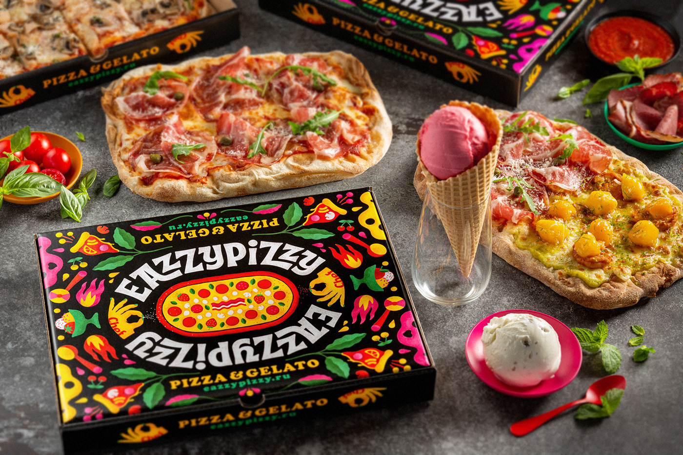
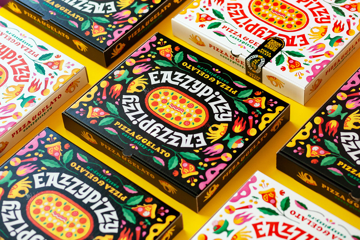
Pizza packaging is one of the important channels of brand communication that connects the product with
the buyer. Therefore, it was important to make the packaging as attractive and juicy as possible.
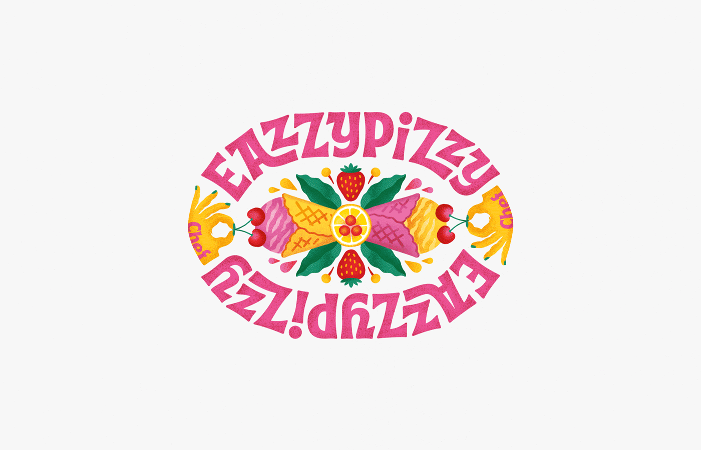
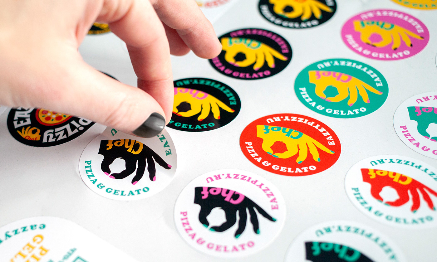
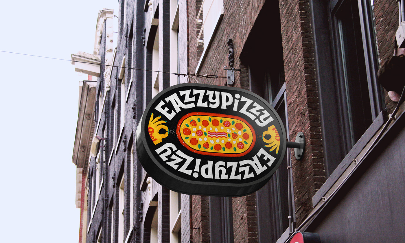
The elongated logo in the form of a "stadium" resembles pizza's characteristic oblong pizza shape.
The peculiarity of such a logo is that it is well read from different sides and angles, no matter how you turn it.
The chef's hands are mirrored on the sides, sprinkling the pizza with spices
and making the emblem more piquant and complete.


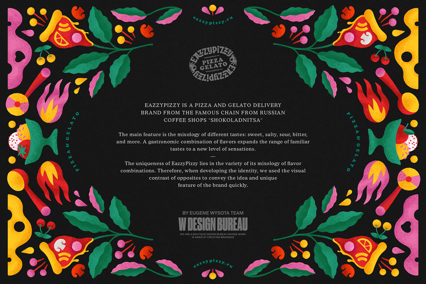
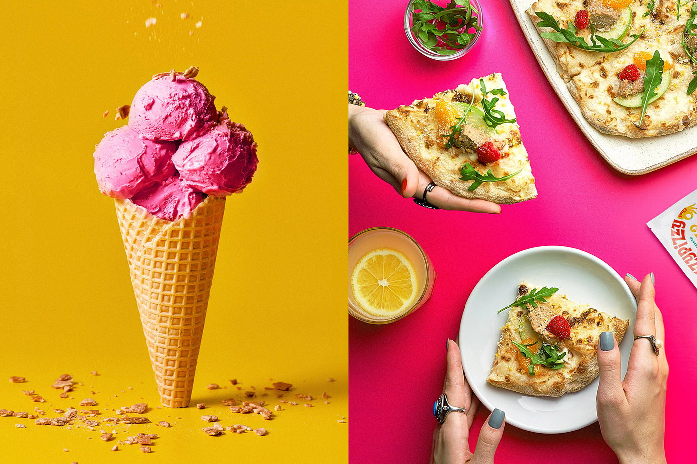
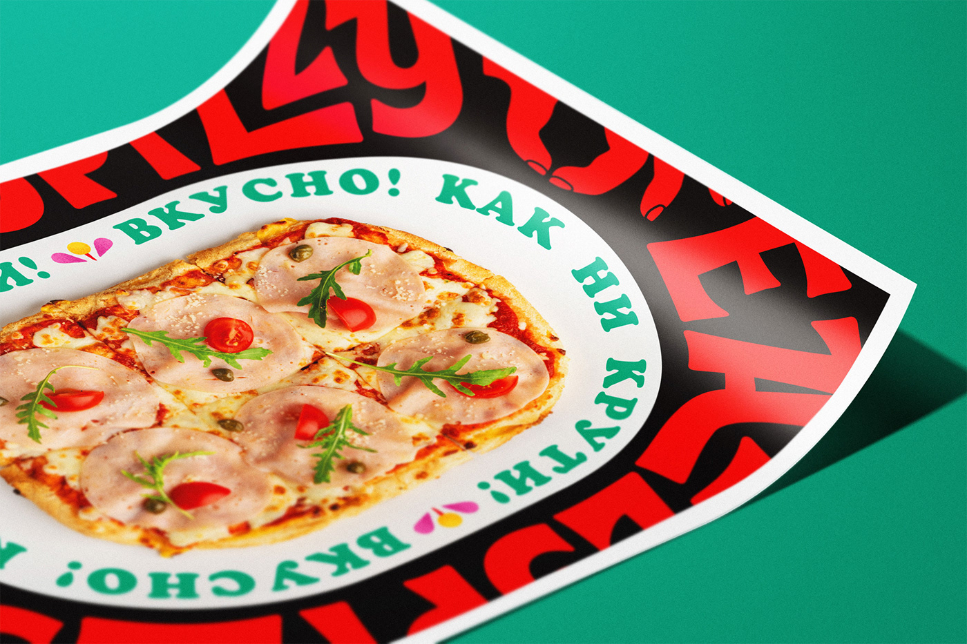
Slightly sloppy bright chaotic graphics of the corporate pattern, juicy appetizing colors, contrast of elements,
use of graininess and color noise in the illustration create a feeling of a gastronomic explosion
and make you want to try it.
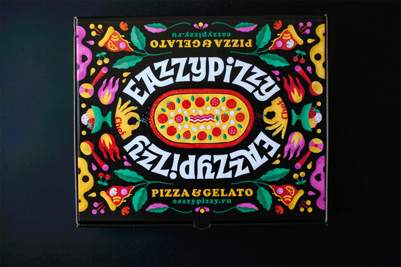


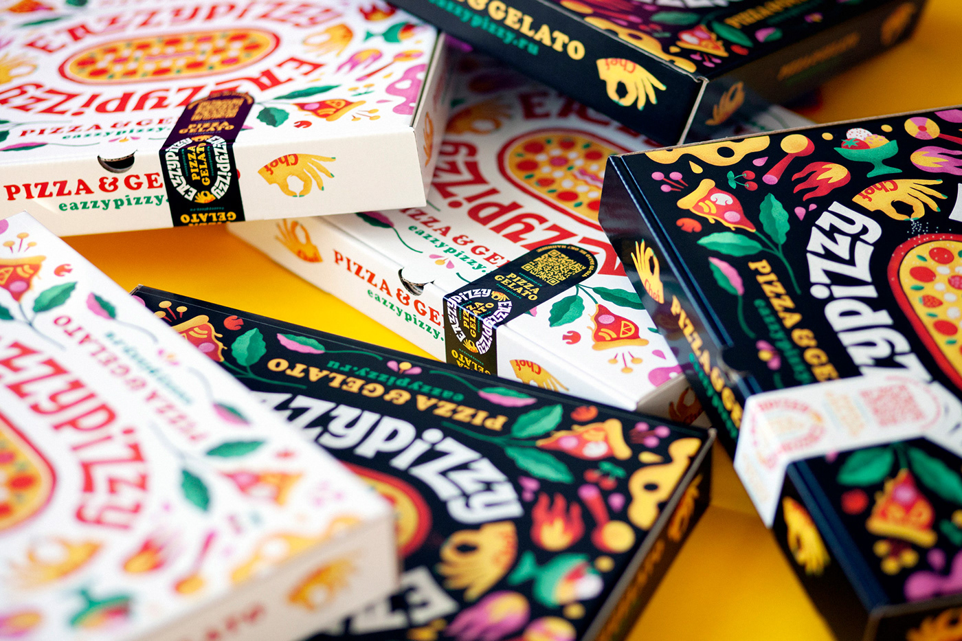
We have developed two versions of the boxes. Bright black packaging for everyday use,
and white for special occasions and holidays.

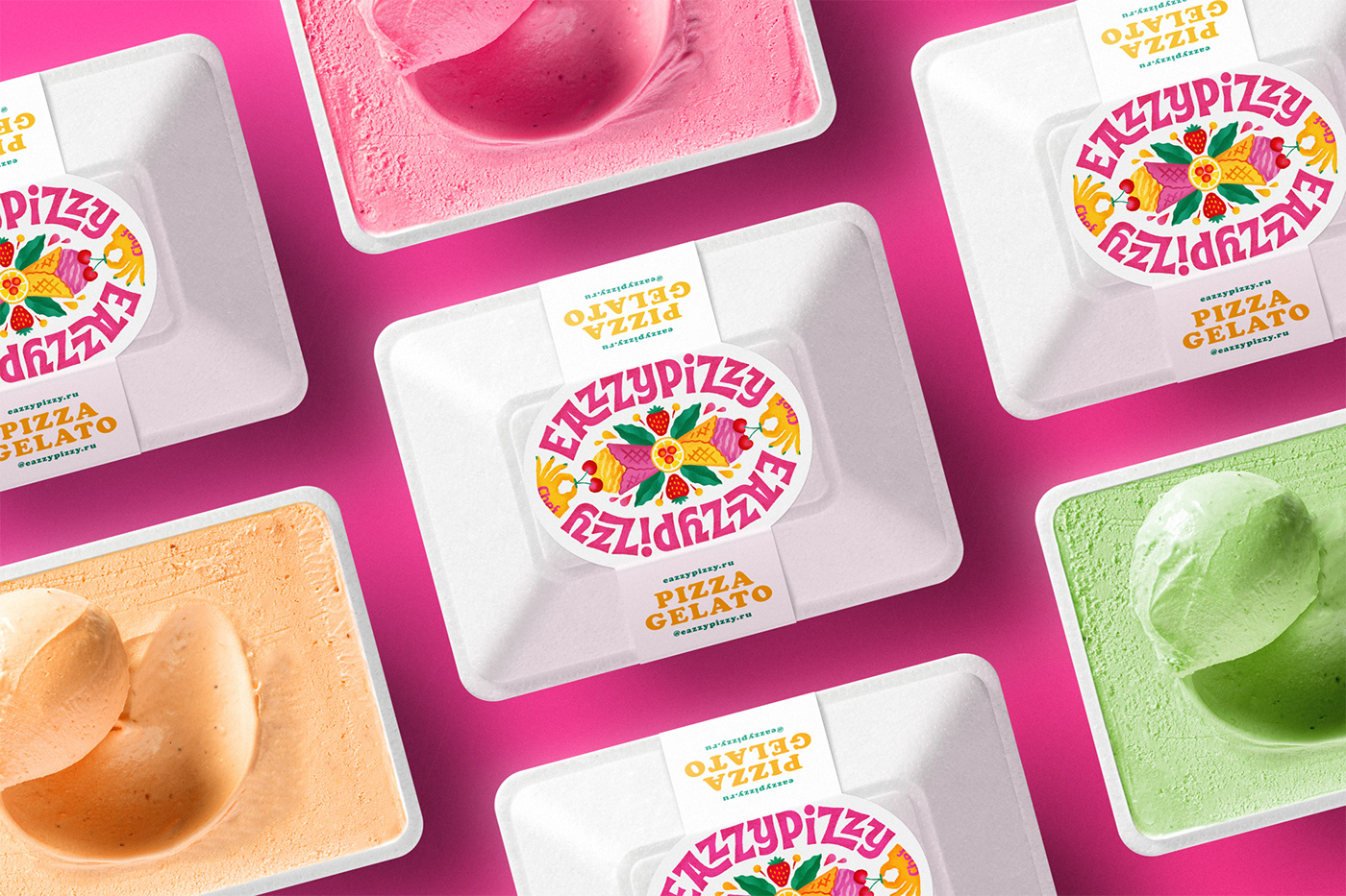

An additional simplified version of the logo is designed for use on wrapping paper,
branded bags, and other elements.


The corporate identity is complemented by pleasant details presented in various stickers,
postcards, posters and other style elements.

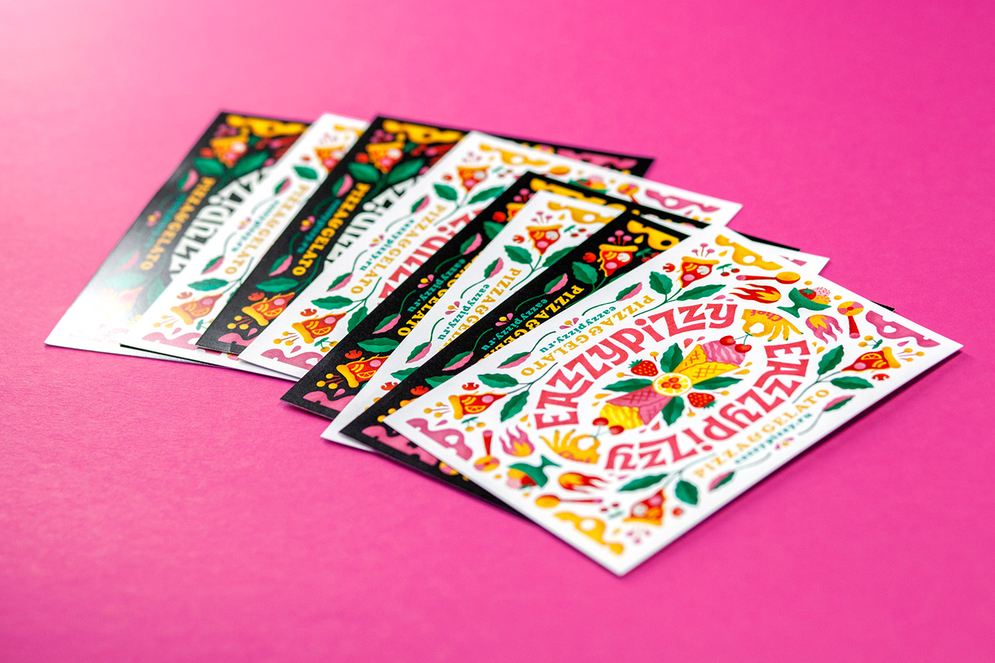


The nice Cooper font is used in promotional materials and communications.
Its rounded shape, warmth, and friendliness fit well into the overall style of the EazzyPizzy brand.